transparent layer
Tröllback+Company Logo

FX

FX Type System Montage

Context

Introduce a groundbreaking custom font system for FX that defies expectations and empowers the talents of its powerhouse creative team, while also developing standout show marketing.

Strategy

Draw inspiration from film titles and experimental typography to establish a new vision for the brand, daring FX to be truly “Fearless” everywhere—from on-air to off-platform.

Solution

A new custom font, animation system, and custom-coded toolkit allow FX to adapt to any mood, series, and setting—alongside focused campaigns for powerful new original programming.

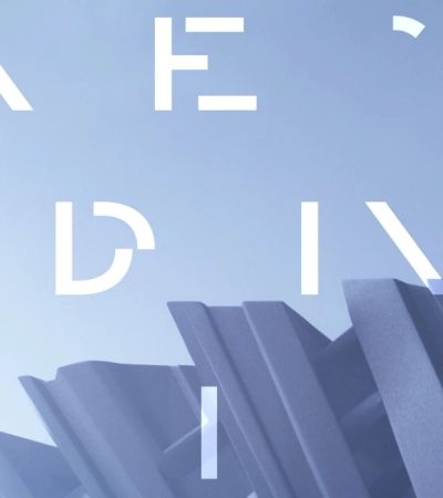
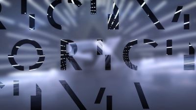
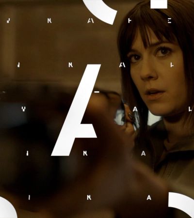
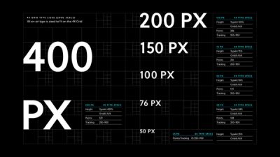
Type System
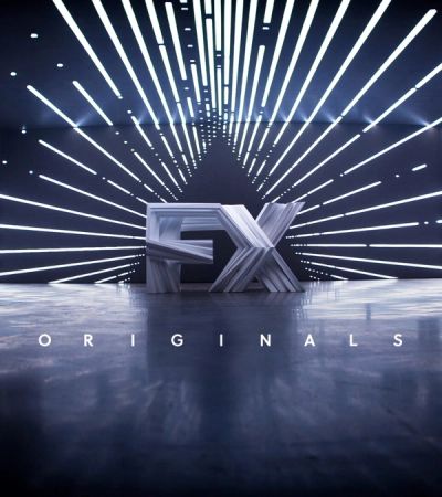
FX Originals card
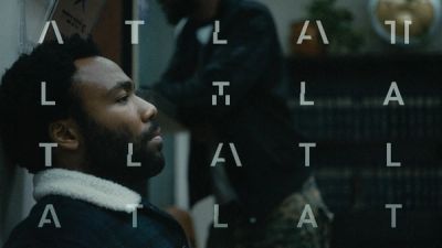
FX Atlanta

Creative Context

Enticing audiences into FX’s world with creativity, collaboration, and unexpected visual resonance.

FX’s award-winning and fan-favorite series are born from a daring attitude that challenges the network to take bigger risks than most entertainment brands. As part of an ongoing, multi-agency initiative to continually redefine its visual identity, we helped develop a new, custom typographic system that reinforces the FX masterbrand while pushing the boundaries on what ‘Fearless’ really means across platforms. Coinciding with FX’s groundbreaking debut on Hulu, our innovative, experimental interstitial system announces a new era for the company that feels bigger, bolder, and more eye-catching than ever.

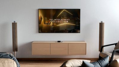
FX Menu
FX Originals
FX Fargo

Graphic Identity

Our daring new type system balances, remixes, and challenges viewer expectations across mediums and platforms.

We wanted to give FX’s in-house team an exponential type system to complement their workflow while giving them the ultimate flexibility to expand their on-air messaging in the future.

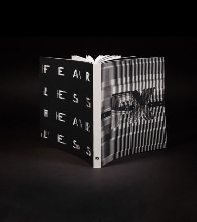
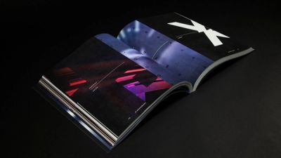
On the design side, a flexible grid system establishes foundational rules — from gridded type patterns to dynamic graphic windows, to inversions, reflections, repetitions, and more. To formalize the system internally and externally, we also crafted and designed an inspiring brand book detailing all of the rules meant to be followed (and broken), featuring a sliding moire-style vellum cover that brings the physical book into motion.

FX style guide

Custom Font Toolkit

Introducing a custom-coded, fully responsive, animated typeface exclusive to FX.

We created a custom brand typeface that modulates within the design system. Inspired by Wolfgang Homola’s Soleil, its shapes are rooted in the modernist principles of clarity and reduction to essential forms, blending simplicity with fluid rhythm.

We then cut up and hand-animated the custom typeface, driving it through a javascript UI panel we built for After Effects that explores and activates every iteration of its creation. Using these settings, FX designers can generate infinite type animations that perfectly match the tone of content without fear of repeating themselves.

FX brand book
FX brand book spread
FX TV

On-Air + Beyond

From industry events to streaming, the best is yet to come…

In the new FX system, everything is a remix, designed to be endlessly innovated across platforms, giving the brand a filmic, experimental look and feel everywhere it travels. Additional animation styles, font weights, and more key graphic elements are also coming soon across platforms.

Mrs. America

Creative Context

How can graphic design capture the zeitgeist and complexity of 1970s feminism in a modern, elevated way?

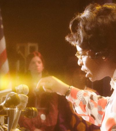
In 1979, the Equal Rights Amendment was on its way to making equality for women a constitutional right in the United States—until one woman brought it all to a halt. FX’s Mrs. America follows the story of Phyllis Schlafly, played by Oscar and Golden Globe-winning actress Cate Blanchett, and her successful fight to stop the ratification of the ERA, revealing the cultural and political divides that continue to define the women’s rights movement to this day.

Our task was to create an episodic package for the new series that authentically captured the era’s essence, grounding our designs in the iconographic look and feel of the ‘70s while finding the irony and humor in which to engage modern viewers’ curiosity about this fascinating and timely story.

Show Logo

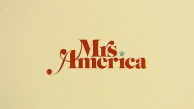
Mrs. America’s show logo is inspired by the decade’s culture, politics, and expressive typography.

In developing a logo that would feel authentic to the show, we drew inspiration from the era’s bold serifs and repeated patterns, as seen on the covers of Philip Roth and Joan Didion novels.

Using Caslon Graphique as our base type, we added artful curves and ligatures that helped capture the decade’s iconic look. Meanwhile, a star dotting the “i” acts not only as a subtle nod to the show’s political themes, but also creates a unique opportunity for creative transitioning and clever motion.

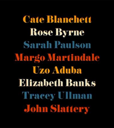
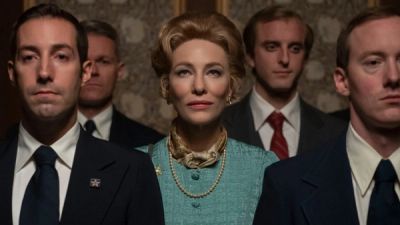
FX Mrs America cast
FX Mrs America Cate Blanchett
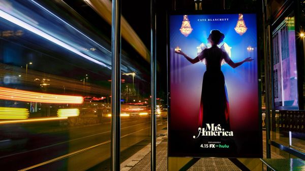
FX Mrs America poster

Graphics Package

In order to create a convincingly-of-the-era show package, we needed to retrofit our design process.

By adding a slight camera jitter, film grain, lens dust, and a subtle misalignment of our frames, we were able to create the tactile look of ‘70s footage with contemporary techniques. Meanwhile, a carefully curated color palette of earthy browns, oranges, and muted jewel tones echoes the home decor of the decade—a nod to domesticity and women’s rights.

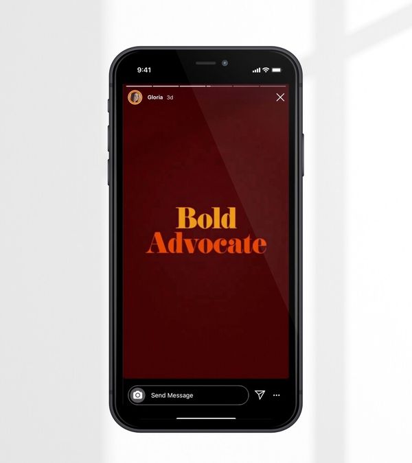
In motion, we made sure to deviate fully from the smooth animation styles we see today in favor of more organic, easy-going, and simple treatments. As a result, interstitials, lower thirds, background snipes, social assets, ratings cards, and more feel analog, slightly off-kilter, and editorial, drawing audiences into the era in a compelling, authentic way.


FX Mrs America Uzo Aduba

Black Narcissus

Creative Context

FX’s fearless new miniseries blends myth and modernity in a psychological drama that transcends time and faith.

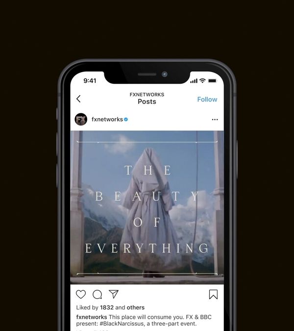
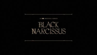
Our role was to develop a cinematic show logo and episodic exploration for the three-part horror series representing the strange forces and perversity at play.

Set in 1934 Nepal, Black Narcissus follows a small cadre of European nuns sent to establish a school in a haunted brothel. Blending holy with erotic, repression with desire, it’s one of our darkest, most twisted show packages to date.


Logo Design

The Greek myth of Narcissus is about beauty, intoxication, sweetness, and control.

We set out to create a logo embodying these themes with a modern, biblical edge. Inspired by Franciscan drop caps, Old Testament typography, and hallucinogenic botanical imagery, our design sets out to be at once alluring and dangerous.

Drawing off a delicate balance of East and West, minimal and ornate, the logo embodies the conflicting, sinister forces at play, while complimenting the beauty and exoticism of its paradoxical location. Thorn petal flourishes and psychedelic filigrees bring a dark elegance to the logo that feels at once opulent and decaying, telling a vibrant symbolic story in two simple words.

Typographic Animation

In motion, delicate type elements shift and transform, invading the minds of viewers with visions of mysticism, sensuality, and superstition.

After an initial logo reveal, we see our intricate type animation grow and shift, edges and curls adding more details and complexity to the design story. Each movement was created to mirror the dreamlike state of the series’ characters, reinforcing the dark and edgy tone of the show.

After animating the show logo, we then rippled out the typographic style across promo titles and interstitial cards, using Fresco backgrounds created and provided by FX, which were used across platforms to promote the new series.

Services

Design Strategy –– Custom Typography –– Graphic Design –– Animation Toolkits –– Motion Guidelines –– Brand Guidelines –– CGI

New business inquiries.

How can we help?

NYC 12:37

STK 05:37

LA 09:37

New York

88 Pine St, 18th Floor
NY, NY 10005

+1 212 529 1010

Stockholm

Fridhemsgatan 53
112 46 Stockholm

+46 733 889 915

Get our newsletter

Sign up for updates,

insights, and inspirations

from our studio.

2024 © Trollbäck+Company