Skillshare: All About Color
Our relationship with color is both personal and communal; it is deeply meaningful. We experience color early on in life. We develop subconscious favorites and strong associations, and without thinking, we derive meaning from them every day. Colors resonate on an emotional level – they reach us in ways that words cannot.
Brands rely on color to convey worlds of information. Colors have the power to encourage spending, generate camaraderie, and denote value. But what is color, really? Former Creative Director Fran Roberts led our team through a skillshare to talk us through the enchanting and complex history of color.
From the Ether to the Color Wheel
History tells us that color is a slippery, nuanced concept. Its meaning differs over time, from one culture to another and from one person to another. There is a tribe in Namibia that doesn’t have a word for blue. They can instead distinguish between shades of green in ways that might be difficult for others. That is to say, for them, blue is simply a shade of green.
Culture is just one of many factors that influence our experience of color, which lives at the intersection of many: environmental, perceptual, material, physiological, and behavioral. There’s never just one way to arrive at “blue” or “green.” It follows that there is no unified or standard theory to explain it.
“Culture is just one of many factors that influence our experience of color, which lives at the intersection of many: environmental, perceptual, material, physiological, and behavioral.”

Current Attempts to Define Color:
- Color is formed by the characteristics of light by which the individual is made aware of objects or light sources through the receptors of the eye, described in terms of dominant wavelength, luminance, and purity.
- Color is the aspect of the appearance of objects and light sources that may be described in terms of hue, lightness, and saturation for objects and hue, brightness, and saturation for light sources
- Color is a phenomenon of light or visual perception that enables one to differentiate otherwise identical objects.
- Color is the visual effect that is caused by the spectral composition of the light emitted, transmitted, or reflected by objects.
But the point is: we can’t talk about visual effects without talking about the human eye, and we can’t talk about the eye without talking about the human brain. Fran poses the question: where does color happen along this pathway? Does it live in the world, on the surface of the retina, or in the mind?
Historical theories about what color is have ranged from the spiritual (black and white are spirits that create color from the ether) and philosophical (are they out there, or in us?) to the measurable and scientific (humans are trichromatic, meaning they have three kinds of cone cells in the eye to process color - birds and fish have four). Texts from Ancient Greece describe colors as the products of fire, air, water, and earth. Sir Isaac Newton developed the first color wheel in the 17th century, identifying primary and secondary colors, with much thought given to color mixing.
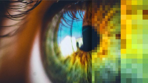
Perception of color is unique to each person depending on their particular cells, brain, memories, environment, learned response, and genetic programming – color is literally and poetically in the eye of the beholder. The human eye receives light reflected off objects, translates that light to color through specialized receptors on the retina, and transmits those messages via electrical signals for the brain to process and interpret in its various, magical ways. Color triggers immediate evaluation by the perceiver; its influence is automatic, and it guides behavior.
Some (mostly objective) facts about color:
Color blindness is not equally distributed in genders - men are 10x more likely to be colorblind.
Women typically experience a wider band of color than men. In some cases (around 3% of the population) women can be classified as tetrachromatic.
Synesthesia is real, and virtually everyone experiences it to some degree due to the very nature of the human brain.
Chromophobia is an intense fear of colors, usually one or two specifically. Mostly this is psychological, sometimes it's an evolutionary adaptation.
The science of seeing color - mapping vision and color spaces
To better understand how to use this information, we can reference different color spaces or color gamuts. A color gamut describes the range of colors we are able to see, or what colors can be produced by a given system, e.g., in our cameras, monitors, printers, and software. In 1931, The Commission Internationale de L’Eclairage (or the International Commission on Illumination) designed a system to mathematically determine different color gamuts.
Color depth describes the amount of information (usually per pixel) that can be stored, which determines the number of possible colors. In RGB, 8 bits of color is still default but is very limiting - 2⁸= 255 shades. 16 bits should have been the default for some time now. 32-bit is the next step, according to Fran, especially when expecting to work with HDR platforms.
Color balance describes the global adjustment of intensities of colors - usually, this happens around a neutral color, like white or gray. It’s really about the differences in color temperature affecting our ability to perceive in a standard, comparable fashion, e.g. Incandescent light burns at 2700K versus sunlight, which burns at around 5500K. Something that looks “white” in one condition will look quite orange or blue when adjusted for the other.
Color correction, on the other hand, is essential during image processing as we are usually moving from one gamut to another (for example, from our eyes to our camera to Photoshop). Image data acquired by sensors – either film or electronic image sensors – must be transformed from the acquired values to new values that are appropriate for color reproduction or display.
Color in the real world
As designers, we deal with the limitations of color technology all the time: in digital, print, still photo, display/OOH, and moving images (which are far and away the most complex). Color processing has become easier but also rife with de-standardization.
Where does this lead us? Why is it useful to understand all this?
As designers, we know from experience that dealing with color is endlessly challenging. It’s digitally cumbersome. Moving from colorspace to colorspace often means we’re losing quality and patience. Any time you do anything with applied color, you’re only as strong as your weakest link (i.e. your smallest gamut). We must adapt to the lowest common denominator. And now HDR has completely turned this world on its head. So what can we do about it?
We have to prepare for the eventuality of high-tech output capability - digital projectors, for example, are rapidly improving - so understanding and planning for better technologies is the first step (thanks, Fran!). Streaming is another good example: HDR is becoming an expectation now - Netflix requires it for almost all deliverables.
A new colorspace on the horizon
Fortunately, Fran’s not the only one thinking about this topic. ACES, the Academy Color Encoding System, is the new industry standard for managing color, brought to us by AMPAS - the Academy of Motion Picture Arts and Sciences (yes - that Academy). ACES is a collection of wide-gamut colorspaces that help with the preservation of quality and also standardize a workspace across already convoluted production pipelines. It aims to be the lingua franca of color spaces - the “biggest bucket” - with color space transforms that don’t degrade the image. It’s a system that gives us an end-to-end color workflow, allowing us to step gracefully from one gamut to another; the pathway for an image is more pure. Because ACES is big: it’s bigger than the color spectrum visible to humans (some colors included only exist to us in Math if you can wrap your head around that), and in doing so gives creators more to work with.
Conclusion
Here’s a list of things to keep in mind as you prepare for a future in color.
- Your eyes deceive you! There are so many biological and neurological components to color perception that it’s crucial to remove as many perceptual biases as possible - or at least be aware that you have them.
- Consider your environment – things like sun splash in a windowed room, highly patterned wallpaper, or a too-bright monitor can wreak havoc on our ability to properly use color. Your eyes are “always on” and your brain is always processing these visual distractions, even if you aren’t actively focusing on them.
- Find the weakest link in the chain – acquisition, intermediation, transfer, output – and assess what you can do to shore it up. Color is only as good as “the slowest ship.”
- 8-bit is not your friend – use 16-bit color depth as a baseline. If you know you’ll be using multiple sources like CG or VFX plates, or you’ll need to really push color around, consider working in 32-bit float depth.
- Avoid long-GOP compression-based formats like h.264 whenever possible, especially during acquisition. Intra-frame compression – ProRes, AVID DNx – are better at all steps of the process. And your editor will thank you.
- Consider the benefits of RAW. It should be a given for still/photo acquisition and can be extremely helpful when employed judiciously for motion acquisition.
Explore more
New business inquiries.
How can we help?
NYC 11:05
STK 05:05
LA 08:05
Get our newsletter
Sign up for updates,
insights, and inspirations
from our studio.


