Reframing authenticity to build the SketchUp brand
Art Director Lili Emtiaz breaks down our team's thought process to build up the new SketchUp branding and motion identity system.
Authenticity has long been a buzzword within our industry, especially in recent years when brands clamber for attention and interaction in more organic channels like social media. Any skilled brand designer knows that a more substantial – and specific – foundation is essential to really making a brand sing, and it starts with a graphic identity; for a brand identity to really be successful, and not just beautiful or eye-catching, it must be true to the brand’s core values.
We worked with SketchUp at a time when it was evolving to meet the needs of the professionals it serves, beyond its legacy status as the tool that made “3D for everyone.” Prior to the design phase, our strategy team solidified a positioning that was all about owning the zone of creative experience in the service of greater ambition. The product itself was the north star: SketchUp champions great design, and inspires creatives to do their best work. This was the story we needed to tell in our design.
We were given a foundational set of colors and typefaces by SketchUp's parent company Trimble, which served as a base as we defined the brand's look and feel. While limitations can sometimes be stifling, they can also be empowering, isolating the key qualities to work with and stay true to. Working within the parameters provided, our first step was to look at a broad spectrum of colors and find ones that fit. To establish further guidelines for our process, we turned to SketchUp's UI. This, to our teams, felt like the truest way to build something meaningful and inspiring to users. Our goal was to design brand elements that both promoted and familiarized our audience with the tool itself.
Next, we looked at how the integration of color and UI played with typography and motion. SketchUp is all about taking a flat idea and visualizing it in 3D space. It was then important to implement that thinking across our motion theory. Starting with flat graphics, and thinking about how they could move through dimensional space, was another way to hint at the brand’s larger purpose.
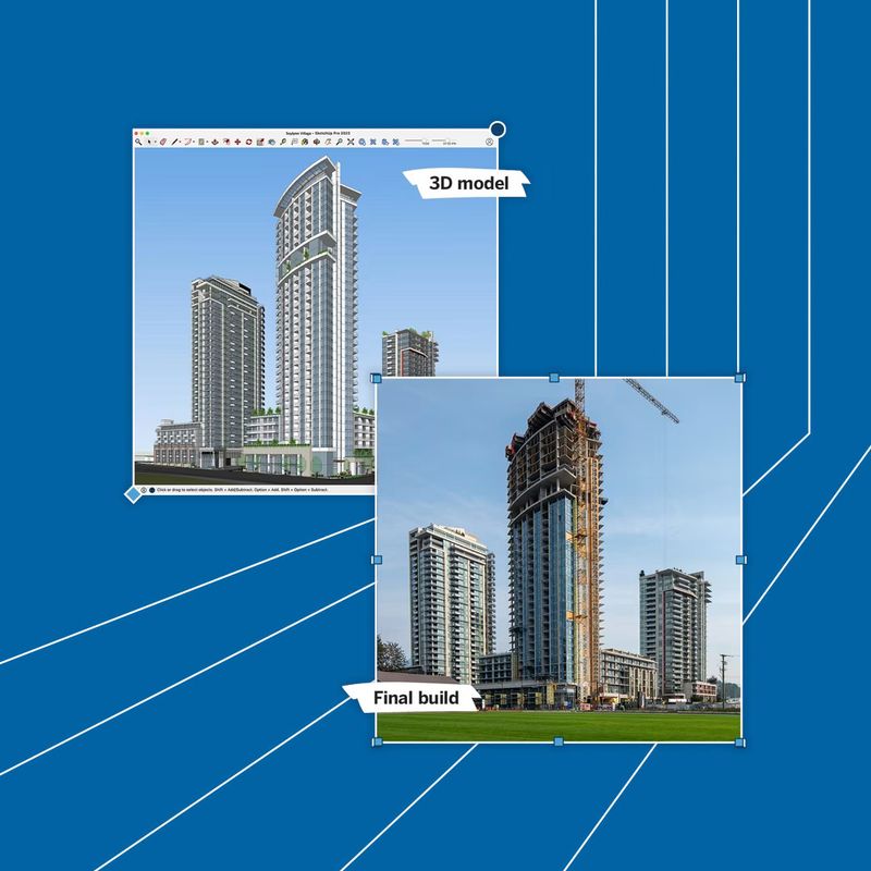
Being literally a tool for architectural world-building, we drew on SketchUp's library of pre-designed structures to flesh out the world we were building for the brand. We ran these 3D objects through After Effects before rendering them into MGRTs to create a flexible toolkit. We could utilize what was built into the program, bringing it to life through evergreen backplates. This allowed us to stay true to the program rather than recreate 3D structures in additional programs. This not only integrated design and brand but also paved the way for future possibilities.
Our first step was to create a brand that felt true to the tool it stood for. The second was creating a toolkit to ripple out this vision through high-volume messaging and any other marketing needs. As a design studio, however, we aim to create brand identities that not only embody and evoke the products and services they represent, but also inspire internal teams to see the way forward. If the strategy is authentic to the product or service, and the design builds on the strategy, it’s a seamless transition from our studio to internal teams – and that’s how we win.
Explore more

Work
+ Branding
New business inquiries.
How can we help?
NYC 11:05
STK 05:05
LA 08:05
Get our newsletter
Sign up for updates,
insights, and inspirations
from our studio.


